
A UX review of Zoom’s video call experience
by Tristan Harward, Head of Product Design at Appcues
Today we’re going to look at popular video conferencing platform, Zoom.
Zoom has spread through offices—home and open-plan alike—like wildfire. While many of us look through squinted eyes at its bare-bones design style and annoying floating toolbar that somehow always seems to be in the wrong spot, the tool keeps taking off at full speed.
That’s due, in part, to the fact that it has really good UX.
That’s a controversial opinion (even around the Appcues office) so let’s talk about it!
UX ≠ UI
The user experience of a video calling platform primarily consists of one main task: talking to other people over a video call.
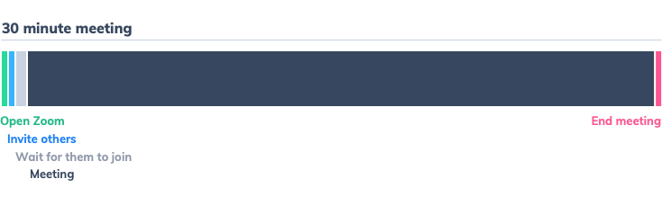
There are surrounding tasks in the user journey—like launching the app, starting a call, inviting callees, recording the call, and ending the call—but over 90% of the time on an average call (we tested it!) is spent simply looking at the other person and conversing.
The job of a video call UI is to enable success at that primary activity above all. In this instance, a successful video call is a good user user experience.
Let’s take a look at Zoom to see how they do it.
Starting a call with Zoom
Zoom is a standard desktop application. We think this might be an advantage when comparing Zoom to web-based competitors.
There’s a single, standard way to start a desktop app, and users don’t have to learn the URL, remember a bookmark, or find the right button on a calendar to get it to work. Adhering to known standards is a good thing.
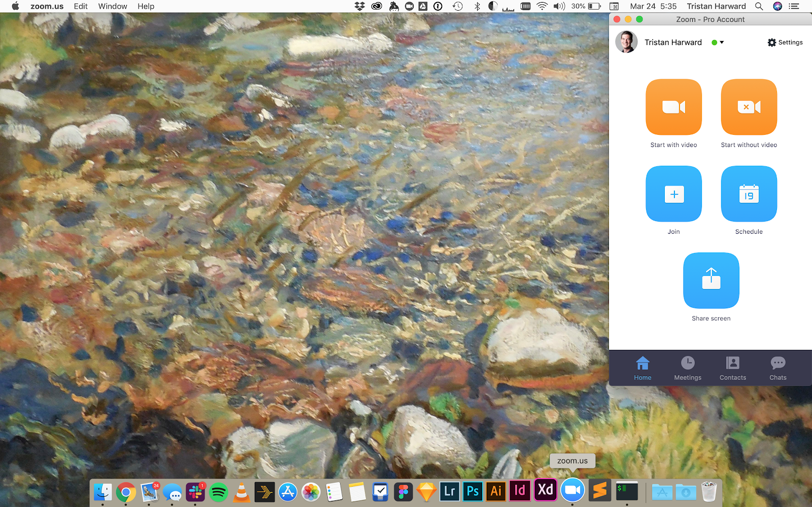
Once opened, users have only a handful of options. Aesthetic preferences aside, the Zoom home screen makes each possible action extremely clear, with both an icon and descriptive text. That’s a great way to help users recognize, rather than have to recall or remember, their purpose (see Nielsen’s 10 usability heuristics: ‘recognition over recall’).
This home screen also makes good use of visual hierarchy in three dimensions: color, size, and position. The most important actions are unmissable: start with video, or start without video.
The second-most important actions are still large and easy to hit (Fitt’s law: it’s easier to hit larger items that are spaced out). Finally the less urgent tasks are smaller and further down the screen (friendly tip for Zoom: you may want to check the contrast on that gray—it’s a bit low at 3.3:1).
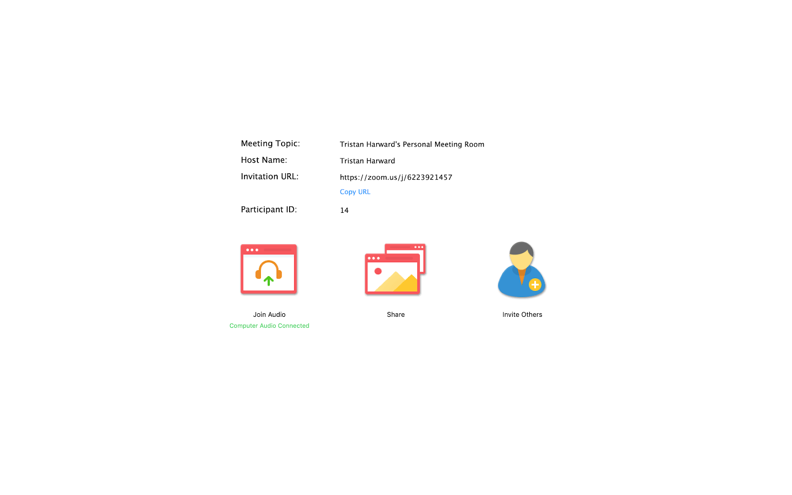
Once a call is started, the user is greeted with this screen. It’s sparse, but it provides relevant information and starter options.
When we talked to a few people in the Appcues office about this screen, a common response was that they didn’t even know those large clipart icons with text were buttons. Zoom could improve the UX here by giving these buttons a clearer affordance for clicking—perhaps making them consistent with the large colored buttons on the start screen.
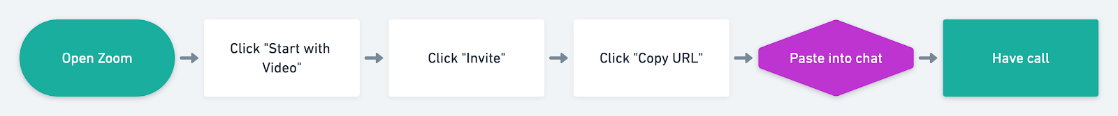
Now, let’s invite some people to our call and see how it goes...
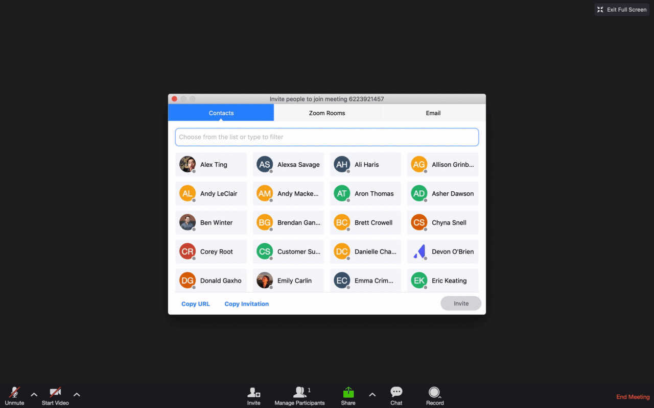
Zoom has improved the UX of this experience recently, and we like it. The interface is clear and uses common patterns: tabs for invite options, a token-based autocomplete to search, and simple tokens for users. It only takes one click to select someone to add to the call.
The large “Invite” button is a hint that this is a select-and-commit pattern. However, it takes a second to catch on—the first time you click a name, for instance, you might think it could immediately call that person. A checkbox pattern might be a good alternative to let users know they’re selecting rather than taking immediate action.
In the end, I decided copying the URL was a better option: It’s a simple, standard way to share an invitation, especially with people who are familiar with Zoom.
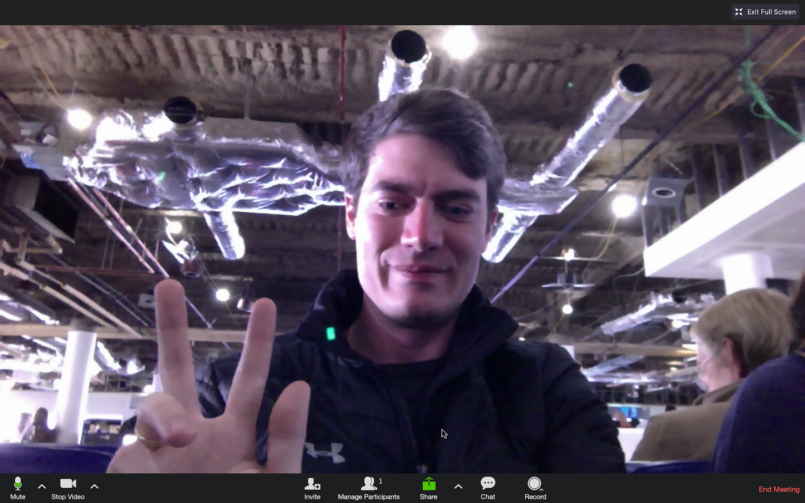
Once someone joins the call (there’s me in the Charlotte, NC airport), you lose those large but ambiguously clickable options and are instead are greeted with the standard Zoom toolbar, revealing all actions in a consistent icon+text style.
Our team frequently misses the “End Meeting” button: It’s style is slightly inconsistent with the rest of the buttons, and it doesn’t stand out as well as it could. It’s definitely something you need to learn and remember.
But once you do, the button is in a good place—its location in the far corner makes it easier to click with fewer errors (again due to Fitt’s law, which also tells us that a button on the edges of the screen is easier to click—it’s effectively infinitely large, at least in full-screen mode).
A 3-click journey to value
So far we’ve identified several usability wins, as well as several issues. Overall, Zoom’s UI is fairly unremarkable.
But if you look at the common path, there aren’t many steps, and the primary actions are clear and simple: You can start or join a call within a few clicks, and truthfully, that’s really all you need to see value from the product.
A 3-click journey to value should be any product’s dream.
What matters most
The good part of Zoom’s user experience doesn’t lie in its interface—it’s in the primary activity the product is for: video meetings. Incidentally, that’s over 90% of the experience, if you look at the total time.
If a product’s primary value—and the majority of time users spend in it—is dependent on having a stable core technology, that’s going to have a large impact on how users evaluate the whole experience.
Of course, with high expectations for reliability, disruptions can be even more problematic, creating moments of frustration and friction. Avoiding those moments of negativity within the core activity is essential to a video conferencing tool’s reputation.
Can you have a really good UX without a really good UI?
Yes, you can.
It’s critical to understand the whole user journey—what users value, and what really makes them happy, or conversely, frustrated. Sometimes it’s the user interface that matters; sometimes it’s not. Really Good UX can mean different things for different products.
That said, Zoom certainly could improve their user interface to make it even easier to make calls and take common actions during them. We hope they continue to do so!
.png)

.jpg)