Twilio’s simple signup flow and personalized onboarding experience
Twilio is a cloud communications platform that lets developers programmatically make and receive phone calls, SMS, and WhatsApp messages.
Their user onboarding experience makes things nice and clear right off the bat—and they do a great job at anticipating and smoothing out any potential points of friction.
Easy signup
Take a look at the signup page, for starters. You know what people hate? Having to enter a credit card to test out a new product and worry about suddenly getting billed for something they weren’t ready to use.
Twilio understands that and uses the copy on this page to make it clear that no credit card is required for the trial. They also do a great job of reiterating value in succinct, scannable bullet points next to the signup form.

3-step product personalization
After creating an account and clicking on that nice, obvious signup button, we’re launched into a short and sweet user onboarding flow that prioritizes simplicity to great effect.
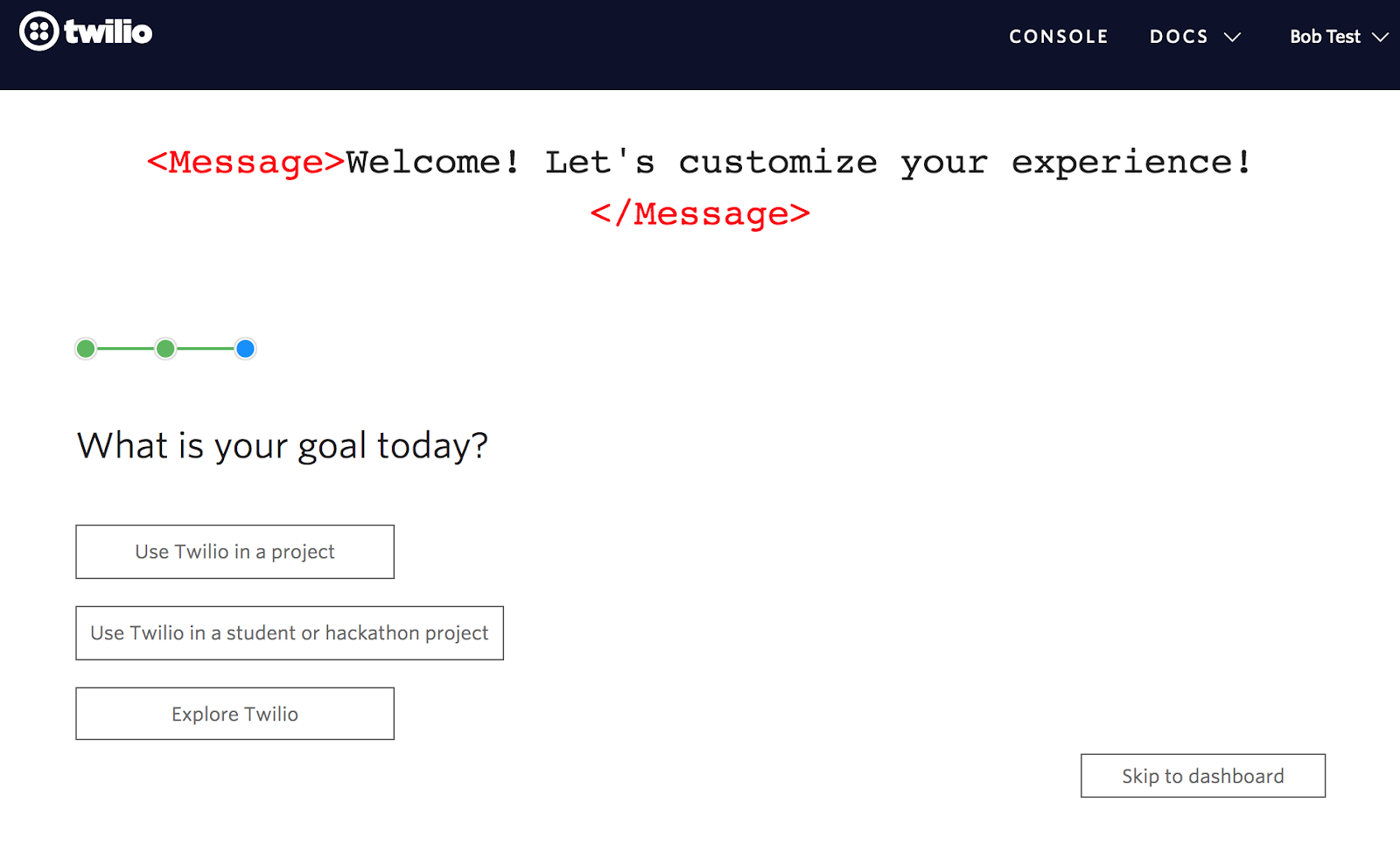
Notice the progress indicator—users can see that this personalization process will be brief, only 3 steps. And the yes/no question—”do you write code?”—couldn’t be easier to answer.

Clicking yes moves us onto the next step (notice that the progress bar changes to reflect our place in the onboarding sequence). This is another simple question, and the options are accompanied by easily recognizable icons to make answering it even easier.

Next, we’re asked about our goals. The 3 broad options are an easy way for Twilio to bucket new users by intent.

But user goals can serve another important purpose of keeping users motivated and giving them something concrete to work toward during their first session. Twilio taps into this on the next screen where we’re asked to select which task we’d like to accomplish first.

The new user experience
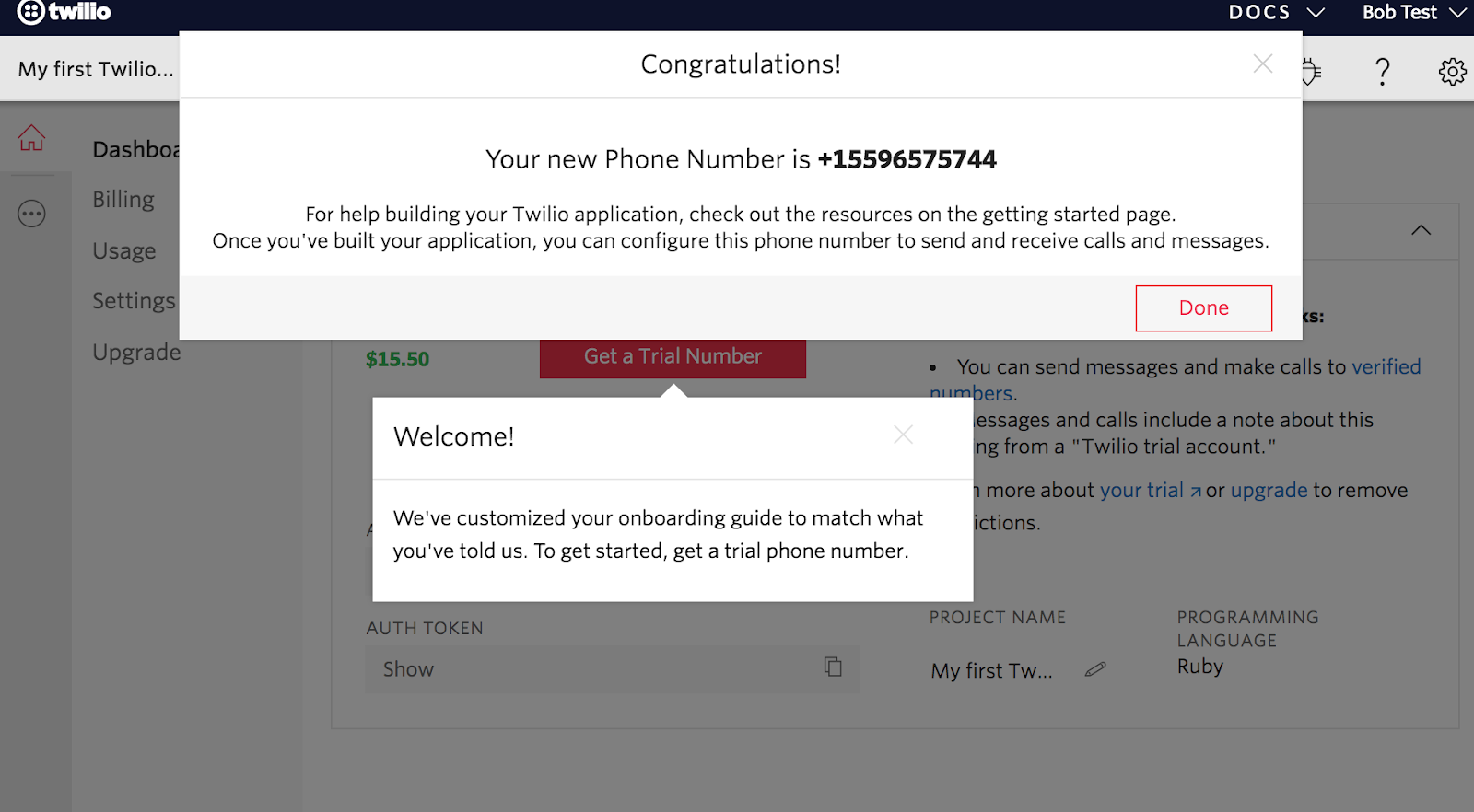
And then we’re in! As new users, we’re dropped into a project dashboard that has been populated with some helps links and info. And look! A tooltip that tells us they’re actually using the information we just provided.

The white-on-white tooltip is a little hard to make out and doesn’t disappear when we click on the associated CTA. The result is a little distracting, which is a shame because the modal window that is triggered by the “Get a Trial Number” button contains important info.


After we get ourselves a trial number and manually click out of that persistent tooltip, we’re ready to start our first project.
This is where Twilio’s onboarding gets clever again—they’ve set up a 3-step quick start guide for us based on the choices we made during signup. Based on our experience in the app so far, we can feel confident that this guide is going to be short, simple, and help us get closer to our goals.

Why this is really good UX:
- Twilio keeps things simple. Clear visual design, a limited number of steps, and unambiguous copy make the onboarding process easy to follow.
- Breaking onboarding up into stages makes it feel a lot more approachable. Rather than launching straight into the first task, Twilio takes a break to show users their dashboard before launching the relevant quick start guide.
- The data they ask of users is limited, relevant, and is immediately put to use in a way that is visible and impactful to the user. This is a great example of product personalization done well.
- Users are given specific goals to work toward during their first session, which helps break up the platform into bite-sized pieces and introduces new users to the features they care most about first.

.png)
.png)
.png)