Mailchimp's real-time password checker
Imagine this: You’re surfing around the web, and come across a new tool you want to try out. So, naturally, you click the big “Create Account” button.
You enter your email or type in a user name, type in a password … you’re almost there, so close!
But then you see it: the dreaded password error message.
If you’re lucky, the error message will help you deduce what’s wrong with the password you entered (e.g. “Your password needs at least one special character). But most of the time, you just have to guess the password requirements, and throw combinations of letters, numbers, and characters at the wall until something sticks.
Not to sound like an infomercial, but: There’s got to be a better way!
And indeed, there is:
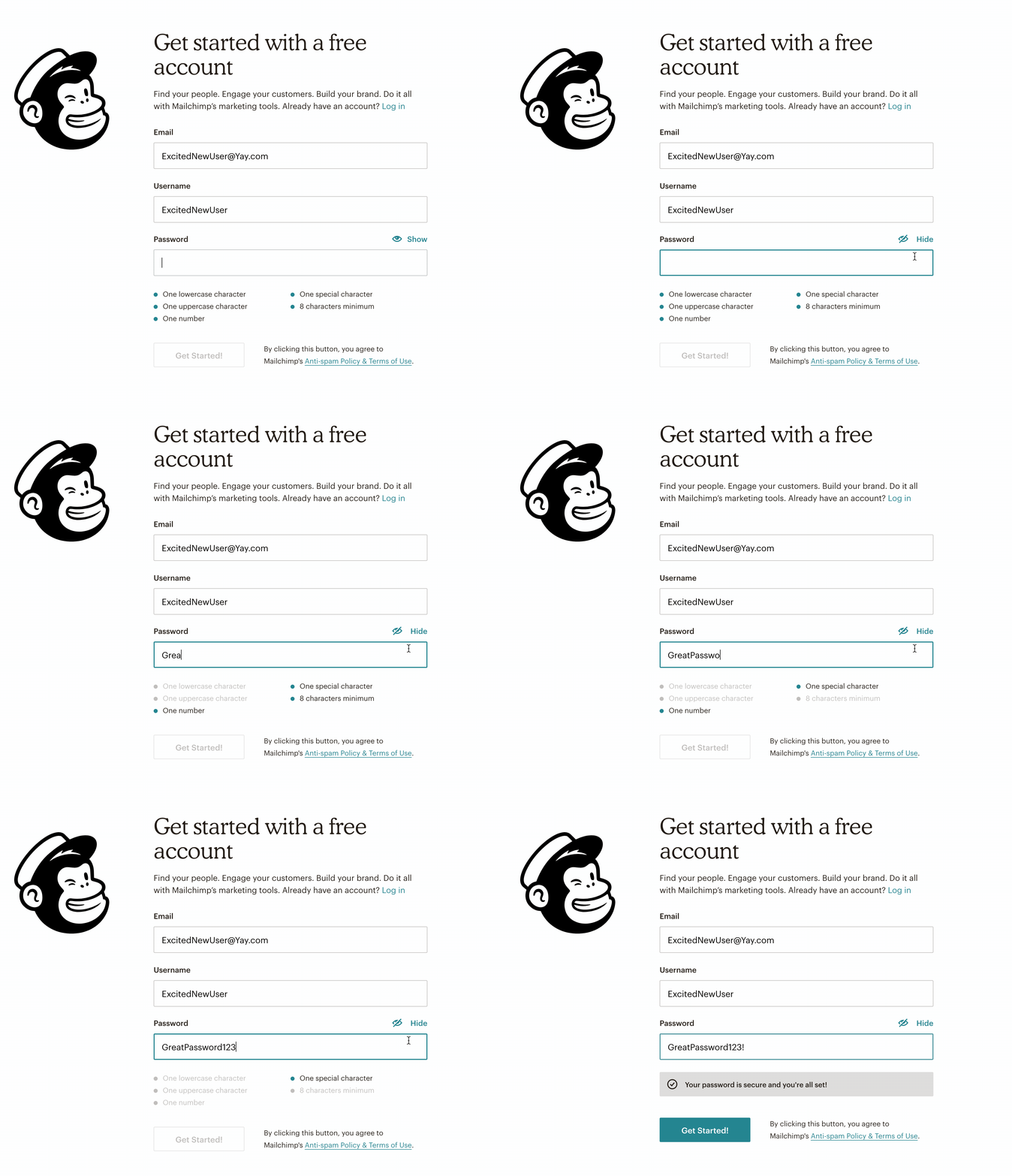
Enter marketing automation platform Mailchimp’s real-time password checker, a simple interactive checklist that does the near-impossible: It imbues the mundane necessity of password creation with a touch of delight.

Why this is really good UX:

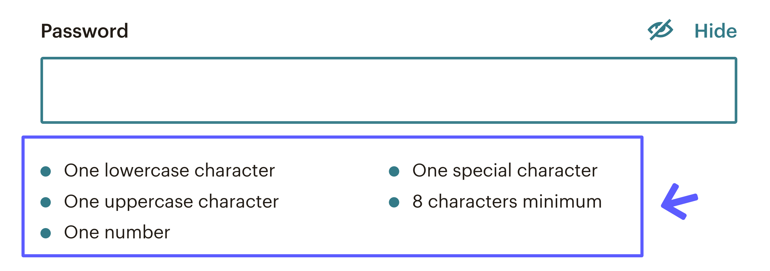
The password requirements list takes all the guesswork out of password creation. Users know exactly what’s expected of them. A classic framework for evaluating usability is human-computer interaction expert Jakob Nielsen’s 10 Usability Heuristics for User Interface Design.
One of Nielsen’s heuristics is error prevention— while it’s great to give people informative error messages (like many password creation experiences), it’s even better to help users avoid those errors in the first place. By making all requirements clear up front, Mailchimp’s password checker is doing a great job of preventing errors, instead of just correcting them.

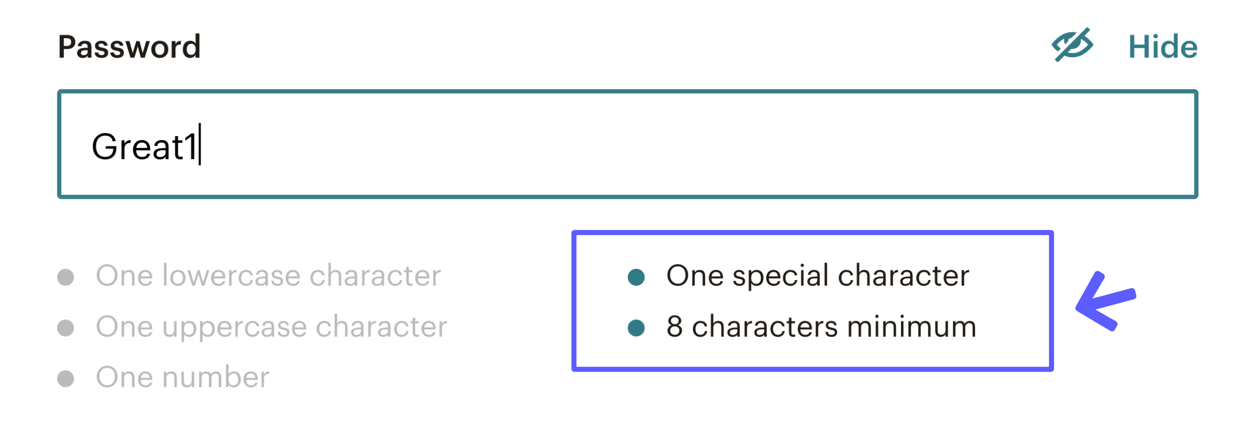
The list is interactive, and shows the user exactly which requirements they have satisfied and which still need to be completed. Another Nielsen heuristic is visibility of system status; basically, interfaces should give clear feedback to users about what’s going on.
The way the list greys out items as users type is a great example of a system giving users clear insight into their status.

The list is replaced by a success message once the password meets all of the requirements. This clear change in status (as well as visual cues of a checkmark icon and green background) make it clear that the user is good to move on to the next step, even if they don’t take the time to read the entire message.
What’s more, this positive reinforcement helps the user subtly build positive momentum, which is a great mindset with which to enter a new application.
Why this really good UX really matters:
The experience of creating a password may not seem like a big deal, but it’s actually quite a critical moment. Roughly two-thirds of users who start sign-up experiences on SaaS applications don’t actually complete the flow.
Given this reality, every small bit of friction that can be removed from the experience has the potential to make a big impact on conversion.
Not only does Mailchimp’s experience mitigate password error friction, it also provides positive momentum for users creating a new account. Now that’s some real really good UX!
.png)
.png)
.png)